
Give Guests a Clear Route Through the Wedding Venue
The Americans with Disabilities Act’s accessibility standards require visual characters to contrast with their background, using light-on-dark or dark-on-light treatments and non-glare finishes. They do not specify a minimum 70 percent contrast ratio. The ADA Standards for Accessible Design regarding visual characters and contrast provide a useful starting point; decorative wedding signs alone cannot establish a venue’s accessibility compliance.
That distinction matters in a converted foundry. Rose-gold lettering on clear acrylic may photograph beautifully against an empty wall, then disappear when guests, coats, and dark brick fill the background. At a freight-elevator lobby, an unreadable arrow leaves arriving guests choosing between corridors.
A wedding sign system gives the celebration a navigable structure—especially when parking, ceremony seating, cocktails, and dinner occupy separate buildings or floors. Its job begins wherever a guest must make a choice.
Missing directions draw immediate attention. A well-positioned sign lets guests keep moving without interrupting their conversation.
Map Four Sign Zones From Parking to Place Settings
Start with the guest route before ordering a matching stationery suite. Each zone has a different reading speed, viewing distance, and installation problem.
- Approach: Identify parking, valet, drop-off points, and accessible entrances. Place directions before the turn they describe. Keep lettering large, sans serif, and brief enough to read while moving.
- Threshold: Confirm that guests have reached the wedding, then deliver any unplugged-ceremony request before they enter the seating area. Separate essential directions from the couple’s welcome message.
- Transition: Locate the seating chart, restrooms, and lounge along the route between ceremony and reception. Give the seating chart enough surrounding space for people to stop without blocking circulation. Alphabetical names help guests search without knowing their table assignment.
- Micro-stations: Put bar menus, dietary labels, and reserved-row markers beside the objects they explain. Decorative script works best for short headings; keep ingredients, names, and instructions in clear lettering.
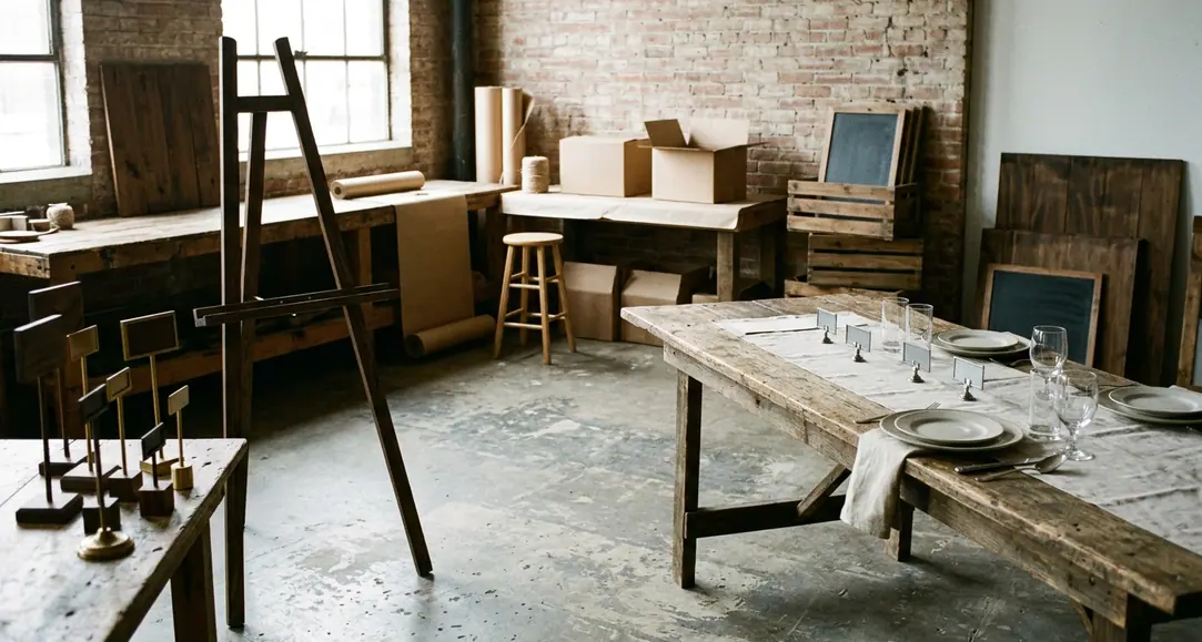
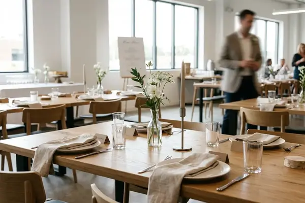
Scale the system to the actual property. A single-room restaurant buyout may need neither exterior directions nor a separate transition board. Extra easels in a compact dining room can obstruct servers and compete with the flowers.
Pair Industrial Materials With Readable Lettering
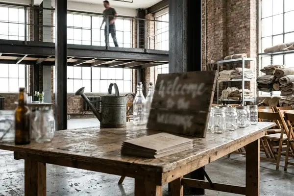
Under warm Edison bulbs, finish matters as much as color. Glossy acrylic and polished metal can reflect the light source across the lettering. Test the finished sample upright under the venue’s evening lighting, from the direction guests will approach.
Choose the Substrate by Placement
- Frosted acrylic: Softens a busy background, although illumination behind the panel can still weaken contrast. Test lettering against the installed backdrop.
- Raw hot-rolled steel: Brings weight and a dark industrial surface. Check edges, mounting capacity, and the supplier’s finish recommendations before outdoor use.
- Brushed brass: Adds warmth beside brick and timber. Its directional sheen still needs a lighting test; pair it with lettering that remains distinct across the surface.
- Reclaimed barn wood: Suits large approach boards, but grain and uneven texture can interrupt fine lettering and adhesive contact.
- Heavy cotton rag paper: Gives menus and seating cards a soft, low-glare surface. Protect it from rain, splashes, and damp tabletop arrangements.
Set primary directions first, then size the names and decorative flourishes around them. Read the mock-up from its intended approach distance while walking. If the arrow or destination disappears, enlarge it or shorten the message.
Pigment Ink Proof
For paper pieces, request a Pigment ink proof on the actual cotton stock. Check small letters, ink spread, and handling marks before approving the full run; the ink name alone does not establish weather resistance.
Humidity also deserves a production decision. Vinyl needs a compatible, properly prepared surface; rough wood makes adhesion harder. Ask the fabricator whether direct printing or painted lettering better suits the board and installation conditions.
Unify the suite through repeated hardware. Matte black iron frames can connect a substantial wooden parking board with delicate linen menu cards held by black clips.
Secure Outdoor Boards and Clear the Gift Table
A lightweight tripod easel puts a broad sign panel above a narrow footprint. Outdoors, wind exposure can make that arrangement unstable. Specify the support together with the sign rather than buying the easel afterward.
Compare the full installed cost: panel, stand, ballast, transport, setup labor, and collection. A rental frame with documented installation requirements may offer better value than a cheaper board that needs improvised supports.
Wind And Mounting
Ask the supplier to specify ballast and operating limits for the complete assembly. Keep weights within the base footprint, clear of walking routes. Move signs indoors when conditions exceed those limits.
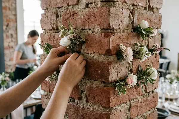
Historic brick and timber require written installation approval. Freestanding iron frames avoid attaching to the building. Use masonry or beam clamps only where the venue approves the attachment point and load. Gaffer tape also needs permission and a surface test; a clean-removal claim does not make it safe for every antique finish.
Consolidate neighboring instructions. Cards, gifts, and guestbook directions can share a tiered display, leaving room to open the book and set down an envelope. Assign a named crew member to remove ceremony-only signs before cocktail hour ends, while retaining directions still needed for late arrivals.
Use a 30-Minute Walk to Finalize Sign Locations
Schedule the walkthrough 30 to 45 days before the wedding, near the ceremony’s planned start time. Bring the floor plan, a phone camera, and the proposed sign list.
- Begin at the furthest parking space. Follow the exact guest route through entrances, corridors, stairs, and reception seating.
- Stop at every choice. Photograph each intersection with the lens roughly five feet above the ground. Where an accessible route differs, document its decisions too.
- Mark the installation footprint. Record the base position, available clearance, background, lighting, and wind exposure on the plan. Note doors and service paths that must remain clear.
- Assign each message. Match the destination, arrow, material, support, and removal time to its marked location.
Before ordering or making a single sign, walk from the furthest parking space to a reception table and mark every place a guest must choose a direction.



Write a Comment