Creative Seating Charts: Alternatives to Paper Displays
The Logistics Problem as Design Opportunity
In my 12 years of designing signage for industrial weddings, I've come to appreciate that the seating chart is the unsung hero of reception design. It solves a logistical nightmare—directing 150 guests to their assigned seats—while simultaneously serving as one of the largest visual installations in your venue.
From a designer's perspective, the seating chart is often the first thing guests see when they enter the reception space. It sets the tone. A flimsy paper printout tacked to an easel signals "afterthought." A custom-built architectural display signals "every detail matters here."
The industrial aesthetic demands materials with presence—surfaces that can hold their own against exposed brick and steel trusses. Paper simply cannot compete. Let me walk you through the alternatives that can.
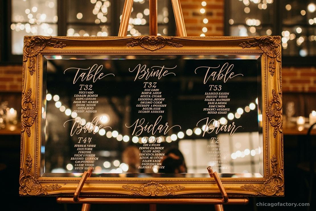
The Mirror: Reflective Elegance
Mirrors are having a major moment in wedding design, and for good reason. A mirror seating chart adds depth to a room, bouncing light and creating visual interest that flat surfaces simply cannot achieve.
Why Mirrors Work in Industrial Spaces
In a warehouse venue with limited natural light, mirrors pull double duty. They display your guest list while amplifying candlelight and string lights throughout the space. The reflection creates an illusion of expanded space—invaluable in intimate loft settings.
- Vintage Ornate Frames: Antique gold or distressed white frames create stunning contrast against raw brick. The baroque curves soften industrial edges.
- Frameless Modern Panels: For a cleaner aesthetic, frameless mirrors with polished edges offer a sleek, contemporary look that pairs beautifully with ghost chairs and acrylic accents.
- Structural Integrity Note: Large mirrors are heavy. A 24x36" mirror can weigh 15-20 pounds. Ensure your easel or mounting system is rated accordingly.
The writing itself can be applied with oil-based paint pens (permanent) or chalk markers (temporary, for rentals). For 100+ guests, I recommend having a professional calligrapher handle the lettering—consistency matters at this scale.
Acrylic Panels: The Transparent Solution
If you've read our guide on Acrylic Welcome Signs, you know I'm passionate about this material. Acrylic seating charts offer the same benefits: a modern, barely-there aesthetic that lets your venue architecture shine through.
Clear vs. Frosted
- Clear Acrylic: Best for venues with beautiful backdrops you want to showcase. The text appears to float in space. Use bold, high-contrast lettering for legibility.
- Frosted Acrylic: Offers better readability in varied lighting conditions. The diffused surface eliminates glare and provides a softer, more romantic look.
- Painted-Back Acrylic: Apply a wash of color (sage green, dusty rose, or classic white) to the reverse side for a custom backdrop that matches your palette.
For a seating chart with 150+ names, I recommend a minimum size of 30x40" to ensure readability. Names should be no smaller than 18pt font equivalent. The structural integrity of the acrylic matters here—use 1/4" thickness minimum to prevent bowing.
Vintage Windows: Architectural Character
Nothing says "Industrial Romance" quite like a salvaged factory window repurposed as a seating chart. The grid of individual panes naturally organizes your tables, and the weathered wood frame adds instant patina and character.
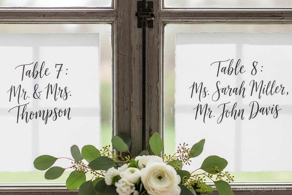
Sourcing and Preparation
Architectural salvage yards are your best friend here. Look for windows with intact glass and frames that are structurally sound (no rot or severe warping). A light sanding and clear sealant can preserve the aged character while preventing splinters.
- Pane Strategy: Assign one table per pane for clear visual organization. If you have more tables than panes, group by alphabetical range (A-D, E-H, etc.).
- Writing Surface: Glass takes paint pens and chalk markers beautifully. Test your marker on a corner first—some glass has coatings that resist adhesion.
- Display: Vintage windows are often irregular sizes. A custom-built stand or simply leaning against a wall (secured with sandbags behind) creates an intentional, curated look.
The Escort Card Alternative: Architectural Installations
Sometimes the most creative solution isn't a traditional chart at all. Instead of one large display, consider an architectural installation where guests pick up individual cards.
Ideas That Work in Industrial Venues
- Copper Pipe Grid: A freestanding structure with horizontal pipes from which cards hang on clips. Modern, scalable, and incredibly photogenic.
- Pegboard Display: Industrial pegboard (like you'd find in a workshop) with numbered hooks. Guests find their name and grab their card—functional and on-theme.
- Suspended Clothesline: Twine or wire strung between posts with cards attached via mini clothespins. Works beautifully against a greenery backdrop.
The advantage of escort cards over a master chart is personalization. Each card can include the table number plus a personal note, a drink token, or a small illustration. It transforms logistics into a guest experience moment.
Typography and Layout Principles
Regardless of which surface you choose, the rules of Wedding Sign Wording apply. Hierarchy is everything.
- Header: Keep it short. "Find Your Seat," "Be Seated," or simply "Seating" works better than lengthy phrases.
- Table Labels: Numbers are faster to process than creative names. If you do use names ("Table Magnolia"), include the number too for efficiency.
- Guest Names: Alphabetical by last name is standard. Consider organizing by table number if your layout makes that clearer.
- Font Size: The header should be visible from 15 feet away. Individual names should be readable from 3 feet.
Display and Placement
Your seating chart needs traffic flow consideration. Guests will congregate here, squinting, searching, sometimes photographing. Place it in an area that can accommodate a small crowd without blocking the entrance or bar.
Lighting is critical. If your chart is in a dim corner, guests will struggle to find their names. Position it near a window for daytime events, or ensure dedicated lighting (uplights or a pin spot) for evening receptions. For comprehensive lighting strategies, see our Venue Styling Guide.
Finally, consider the stand or display method. We cover this extensively in our guide on Easel Styling Tips, but the key principle is: the display should complement, not compete with, your chart.
Frequently Asked Questions
Finalize your seating assignments 2 weeks before the wedding, after RSVPs close. However, have your display surface ready earlier—order custom acrylic or secure your vintage window at least 6-8 weeks out. The actual names can be added in the final week.
Yes, but use the right tools. Oil-based Sharpie paint pens are permanent and can be removed with rubbing alcohol. Water-based chalk markers wipe off easily but may smear if touched. Always test on an inconspicuous corner first, and ask your rental company about their cleaning policies.
Always have a backup. Assign a bridesmaid, groomsman, or day-of coordinator to stand near the seating chart during cocktail hour. They can assist confused guests and direct any last-minute additions (plus-ones, name spelling issues) to a discreet "overflow" table.
If you're using a mix of round tables, rectangular kings tables, and sweetheart tables, include a small legend or floor plan diagram near the seating chart. It helps guests visualize where they're headed and reduces bottlenecks.
About the Author