Chic Table Numbers That Match Your Industrial Theme
The Most Overlooked Detail
In my years coordinating luxury weddings, I’ve seen couples spend thousands on floral clouds and custom linens, only to slap a cheap paper card on a metal stick and call it a table number. I often tell my clients: the table number is the first thing your guests look for when they enter the reception. It guides them to their home base for the evening.
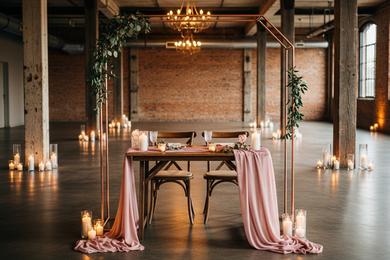
From a planner’s perspective, this small marker is a prime opportunity to reinforce your aesthetic. In an industrial setting—think West Loop lofts and converted warehouses—you need materials that can stand up to the architecture. We are trading cardstock for concrete, acrylic, and steel.
The Ghost Look: Acrylic
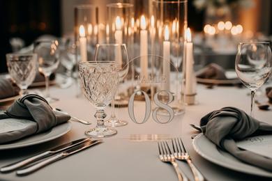
Acrylic is the darling of modern wedding design for a reason. It is sleek, unobtrusive, and catches the candlelight beautifully. For a table laden with wine glasses and floral centerpieces, a "ghost" table number is practical because it doesn't block sightlines. Guests can see right through it to converse with the person opposite them.
To keep it readable, opt for bold white or black calligraphy. If you are styling a Sweetheart Table, you might switch to a larger, frosted acrylic piece to differentiate your head table from the guest tables.
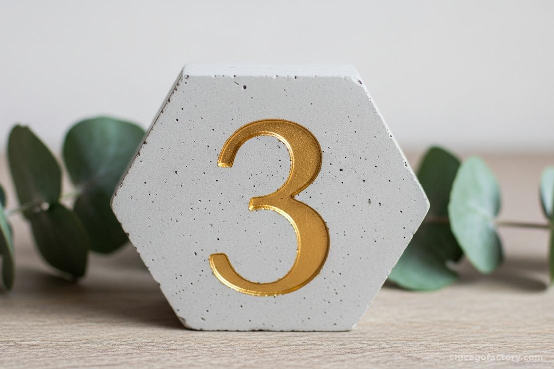
Gritty & Grounded: Concrete
Nothing screams "industrial" quite like concrete. We are seeing a huge trend in small, cast concrete blocks stenciled with gold or copper digits.
This material brings a necessary weight and texture to the tablescape. It contrasts perfectly with soft chiffon runners and delicate blooms. Plus, unlike a flimsy paper card in a wire holder, a concrete block won't get knocked over when a guest reaches for the bread basket.
Metallic Accents
If your venue features exposed piping or metal trusses, echo those elements in your table numbers. A copper pipe stand or a laser-cut steel number adds a sharp, architectural edge to the dining experience.
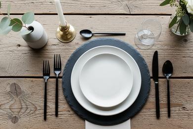
Be mindful of your overall palette. As we discuss in our Metallic Color Palettes guide, you want to mix metals intentionally. If you have gold flatware, a matte black or brass table number looks sophisticated. If you have silver flatware, go for chrome or slate grey.
Height & Visibility
Styling is about balance. If you have tall, towering centerpieces, your table number needs to be visible without competing. I recommend either keeping the number low (tucked near the base of the vase) or suspending it high.
For a truly cohesive look, ensure your table number font matches the menus and place cards. It’s these subtle repetitions that make a Minimalist Table Setting feel curated rather than sparse.
Frequently Asked Questions
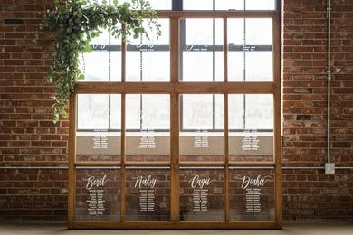
Numbers are functional and efficient. While naming tables after "Places We've Traveled" is cute, it can be a nightmare for guests trying to find their seat in a crowded room. If you do use names, include the number as well (e.g., "Table 1: Paris").
One per table is standard. However, for long rectangular "king's tables" or farmhouse tables that seat 20+ people, I recommend placing a number at both ends of the table so guests approaching from either side can navigate easily.
Absolutely. Generic numbers (1-20) are standard rental inventory for most decor companies. It’s a great way to get high-end materials like marble or acrylic without buying 20 items you’ll never use again.
About the Author