The Clear Choice: Why Acrylic Welcome Signs Are the Anchor of Modern Decor
In my twelve years of working in industrial design and running a laser-cutting boutique, I have watched wedding trends shift from burlap and lace to something far more refined: the era of acrylic. There is a reason this material has become a staple for modern couples. It offers a "barely there" aesthetic that manages to be both substantial and airy, bridging the gap between classic elegance and industrial edge.
But from a designer's perspective, not all acrylic is created equal. Achieving that high-end, glass-like finish requires understanding the material itself—from the gauge (thickness) to the casting method. Whether you are aiming for a minimalist look or a bold, painted-back statement, the acrylic welcome sign is the first impression your guests will have. Here is how to execute it flawlessly.
Material Matters: Cast vs. Extruded Acrylic
When sourcing your signage, the structural integrity matters. I always advise couples to look for "Cast Acrylic" rather than "Extruded." Cast acrylic is harder, polishes to a clearer edge, and is less likely to crack during the engraving or vinyl application process.
Thickness is another crucial factor often overlooked. For a standard 18x24" welcome sign, a 1/8-inch thickness can feel flimsy and may bow if placed on a standard easel. I recommend stepping up to a 1/4-inch gauge. It feels luxurious, stands rigid, and catches the light beautifully, mimicking the weight of real glass without the fragility.
The Art of the Painted Back
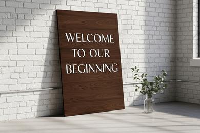
One of the most enduring trends we are seeing this season is the "brushstroke back." This involves applying acrylic paint to the reverse side of the sign to create a textured background for the text.
This technique serves a dual purpose: it adds a pop of color to match your palette, and it ensures legibility against busy backgrounds. If your venue has visually complex elements, like the exposed brick walls discussed in our Warehouse Venue Styling Guide, a painted back ensures your names don't get lost in the texture.
Typography and Layout
The transparency of the medium demands bold typography choices. Since there is no "negative space" in the traditional sense, the font becomes the primary visual element. Modern sans-serif fonts in vinyl or laser etching offer a clean, architectural look that fits perfectly within the Industrial Style aesthetic.
When deciding what to write on your sign, keep it minimal. "Welcome," the couple's names, and the date are often enough. Crowding the surface defeats the purpose of the clear material.
Displaying Your Sign
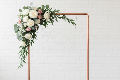
Finally, gravity is a factor. Acrylic is dense. To display it safely and stylishly, you need a support system that complements the modern vibe. A heavy-duty copper pipe stand or a minimalist metal easel is preferred over traditional wooden tripods.
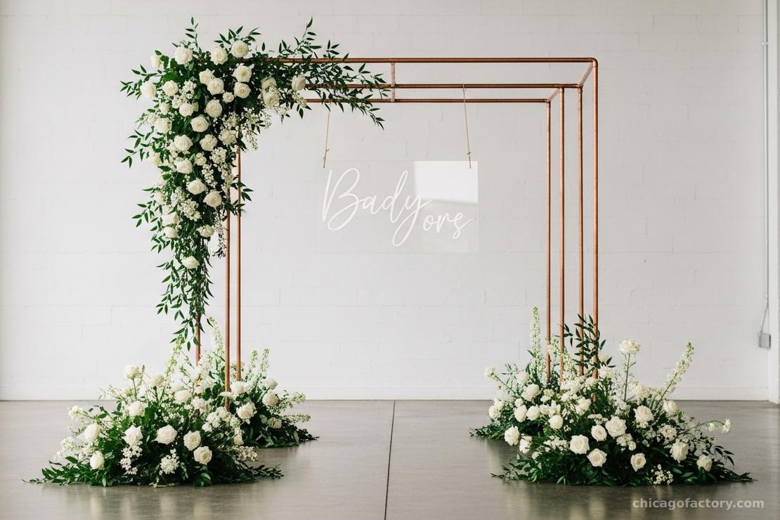
For more mechanics on keeping your signage secure, refer to our deep dive on Easel Styling Tips.
Final Thoughts
Acrylic is more than just plastic; it is a design element that plays with light and space. By choosing the right thickness and styling it with intention, you turn a simple greeting into a piece of modern art.
Frequently Asked Questions
For a rigid, high-quality look, 1/8 inch (3mm) is the absolute minimum, but 1/4 inch (6mm) is recommended for signs larger than 18x24 inches to prevent bending.
Always use a microfiber cloth and a cleaner specifically designed for plastic (like Novus) or mild soap and water. Never use Windex or glass cleaners containing ammonia, as they will cloud the material over time.
Yes, acrylic works well with dry erase or chalk markers, making it a great reusable option. However, for a permanent, professional look, vinyl decals or laser engraving are preferred."
About the Author