Lit: How to Style Custom Neon Signs at Your Reception
The Glow Up: Neon in Industrial Spaces
In my 12 years of designing and manufacturing wedding signage, few trends have exploded quite like the custom neon sign. What started as a niche request for "dive bar chic" has evolved into a staple of modern luxury weddings. But there is a fine line between a sophisticated art installation and a tacky billboard.
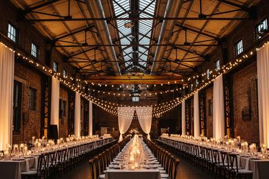
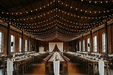
From a designer's perspective, neon is about energy. It dictates the focal point of the room. In an industrial venue—where you are often working with raw materials like concrete and steel—the soft, humless glow of modern LED neon adds a necessary layer of vibrancy. It bridges the gap between the gritty architecture and the celebration.
Placement Strategy: Beyond the Photo Booth
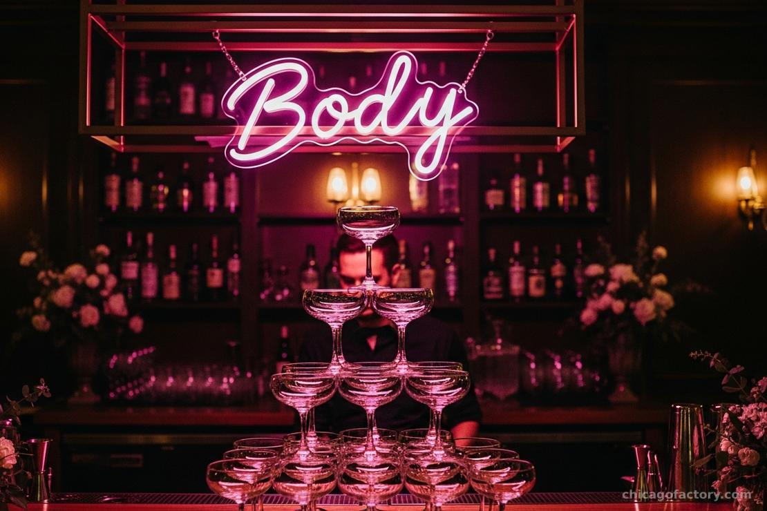
While the photo booth backdrop is the most common home for neon, it isn't the only option. To truly embrace the "Industrial Romance" aesthetic, consider these high-impact placements:
- The Bar Header: The bar is the second most visited spot at the reception (after the dance floor). Hanging a sign here—perhaps something playful like "Drunk in Love" or a custom monogram—draws guests in and anchors the space.
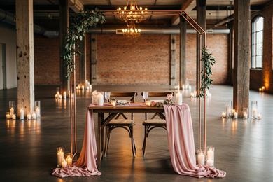
- The Sweetheart Table: Frame the couple. We often recommend suspending neon from a copper pipe stand or integrating it into Hanging Floral Installations to create a halo effect above the head table.
- The Ceremony Backdrop: For a bold, non-traditional look, a soft white neon sign against a dark brick wall can serve as a modern altar.
Technical Details: Glass vs. LED Flex
When sourcing your sign, the material matters. Traditional glass neon is fragile, expensive, and runs hot—a liability at a crowded wedding.
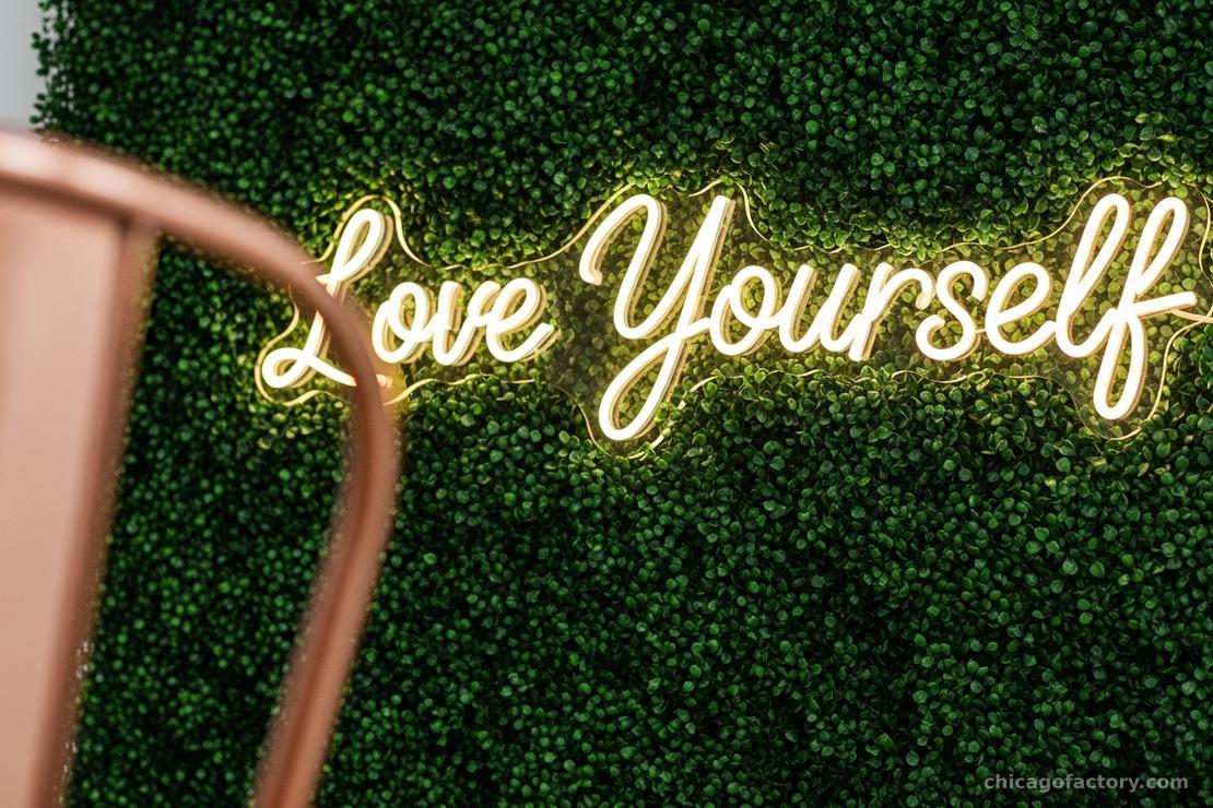
We exclusively recommend LED Neon Flex. It mimics the look of traditional glass but is encased in durable silicone. It’s cool to the touch (safe for curious flower girls) and far easier to transport. When evaluating a vendor, ask about the "backing." For a seamless look, request a "cut-to-letter" acrylic backing rather than a large rectangular box, which can catch glare in photographs.
Choosing Your Phrase
The design of the sign is only as good as the typography and the message. Because neon requires continuous lines, script fonts generally work best and offer the most structural integrity.
If you are struggling to decide between your last name or a quote, consider longevity. A sign that says "The Millers" can be reused in your home for years. A sign that says "Til Death Do Us Party" might be harder to style in a living room later. For more inspiration on phrases, check our guide on Wedding Sign Wording.
Installation & Safety
Gravity is not your friend when it comes to heavy acrylic backboards. Never rely on double-sided tape or command strips for a neon sign.
Most venues will not allow you to drill into their brick or drywall. The solution? Fishing line and S-hooks. If you are mounting on a truss or a greenery wall, clear fishing line is invisible to the camera and incredibly strong. Always ensure you have access to a power source nearby—extension cords should be taped down with gaffer tape to prevent tripping hazards. For more on rigging decor safely, refer to our Venue Styling Guide.
Frequently Asked Questions
Warm White is the most flattering. It mimics candlelight and complements skin tones. Bright red or deep blue can "blow out" in camera sensors, causing a blur, and can cast strange tints on your guests' faces.
Since we no longer manufacture in-house, we advise allowing 4-6 weeks when ordering from reputable artisans. Rush orders often sacrifice the quality of the soldering connections.
Yes! If you want a generic phrase like "Let's Party" or "Love," renting is a sustainable and cost-effective option. You only need to purchase if you want a custom name or date.
About the Author