Industrial & Rustic: Styling Wood Signs for Modern Lofts
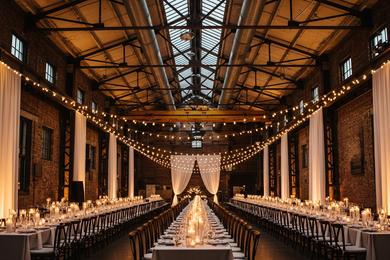
Finding Warmth in the Warehouse
In my 12 years of running the Chicago Factory manufacturing floor, one of the most common misconceptions I encountered was that "wood" equals "barn." While raw timber is the backbone of the country aesthetic, it plays a vastly different, architectural role in an industrial setting.
When we design for lofts, warehouses, and converted factories, the goal isn't to create a farmhouse look; it is to introduce warmth. Industrial venues are defined by cool tones—grey concrete, red brick, and black steel windows. A strategically placed wood sign acts as a grounding element, softening the harsh edges of the architecture without sacrificing that modern edge.
Material Selection: It’s Not Just "Wood"
As an industrial designer, I can tell you that the difference between a "crafty" sign and a "luxury" installation lies entirely in the finish. For an Industrial Romance aesthetic, avoid rough, unfinished pallet wood. Instead, look for:
- Birch Plywood: Smooth, uniform grain that takes stain beautifully. It creates a clean, flat surface for lettering.
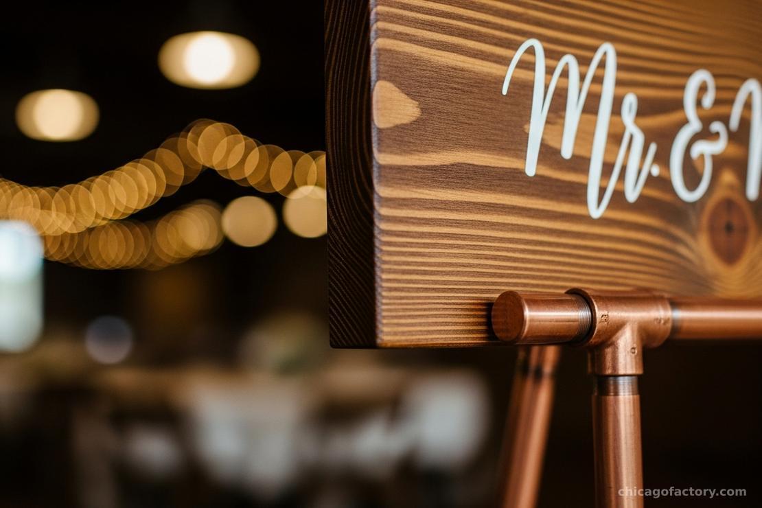
- Dark Walnut Stains: Deep, rich browns contrast elegantly with white calligraphy and offer a more formal look than lighter pine.
- Thickness Matters: A sign that is too thin (under 1/4 inch) will warp in humidity. We always recommended 1/2 inch thickness for standalone signs to ensure structural integrity.
The Rule of Contrast
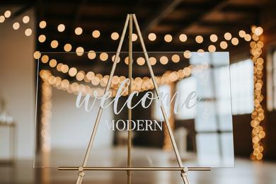
To keep the look modern, you must pair wood with sleek materials. If you have a wood sign, don't put it on a wood easel—that’s too much timber.
Instead, lean into the contrast. Place a rich timber seating chart on a copper pipe stand or lean it against a ghost chair. This interplay of textures is what we discuss in our Venue Styling Guide. The metal and acrylic elements sharpen the look, preventing it from feeling too rustic.
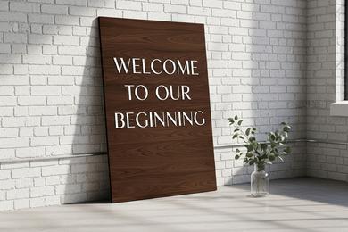
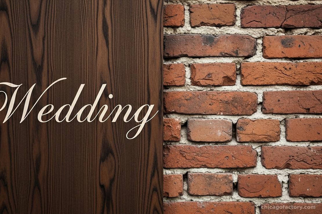
You can also rely on the venue itself to provide this contrast. A smooth, dark wood sign placed directly against a rough, red brick wall creates a stunning visual tension that photographs beautifully.
Typography & Layout
The font you choose dictates the vibe. For a loft wedding, avoid "western" or heavily distressed fonts. I recommend clean, bold sans-serifs or modern calligraphy.
Pro-Tip: If you are worried about the wood feeling too heavy for a summer wedding, consider mixing your signage. Use wood for the large Welcome Sign to anchor the entrance, but switch to lighter materials for other elements. See our comparison on Acrylic vs. Wood Signs to decide where each material shines best.
Display Mechanics
Wood is significantly heavier than acrylic or foam board. During my time in production, we saw many couples underestimate the weight of a 24x36" solid wood board. Ensure your easel or stand is rated for the weight. A flimsy aluminum tripod will topple over.
If you are unsure about how to safely prop up these heavier pieces, especially in a breezy outdoor courtyard or a high-traffic entryway, review our guide on Easel Styling & Safety.
Frequently Asked Questions
Yes, but they must be sealed. Unsealed wood will absorb moisture from the air (even without rain), causing it to warp or the vinyl lettering to peel. Ensure your sign has a matte or satin polyurethane clear coat if it will be outside for more than a few hours.
Not if the finish is right. A dark espresso or ebony stain with gold or white lettering is incredibly sophisticated. Avoid "distressed" or "shabby chic" finishes for formal events.
Dust gently with a microfiber cloth. Do not use wet sprays or chemical cleaners directly on the lettering, as this can weaken the adhesive of the vinyl or smear hand-painted ink.
About the Author