Copper, Gold, & Steel: Mastering Industrial Color Palettes
The Alchemy of Design
In my 12 years of designing for the Chicago event industry, the most common question I receive isn't about flowers or food—it's about metal. "Can I mix gold flatware with the venue's silver beams?" "Will copper look too rustic?"
From a designer's perspective, metal is a neutral. In an industrial setting—defined by raw concrete, weathered brick, and exposed ductwork—metallic accents are the bridge between the grit of the architecture and the glamour of the wedding. The secret to "Industrial Romance" isn't picking one metal; it's mastering the interplay of several.
The New Rule: Mix, Don't Match
The old school rule of "pick one metal and stick to it" is dead. In fact, a room that is exclusively silver can feel sterile and cold, especially in a warehouse. To create depth and warmth, you must layer your finishes.
However, there is a formula to keep it from looking messy. I use the 60/30/10 Rule:
60% Dominant Metal: Usually dictated by the venue (e.g., steel beams or Industrial Lighting fixtures).
30% Secondary Metal: Your major decor elements (e.g., gold flatware or chairs).
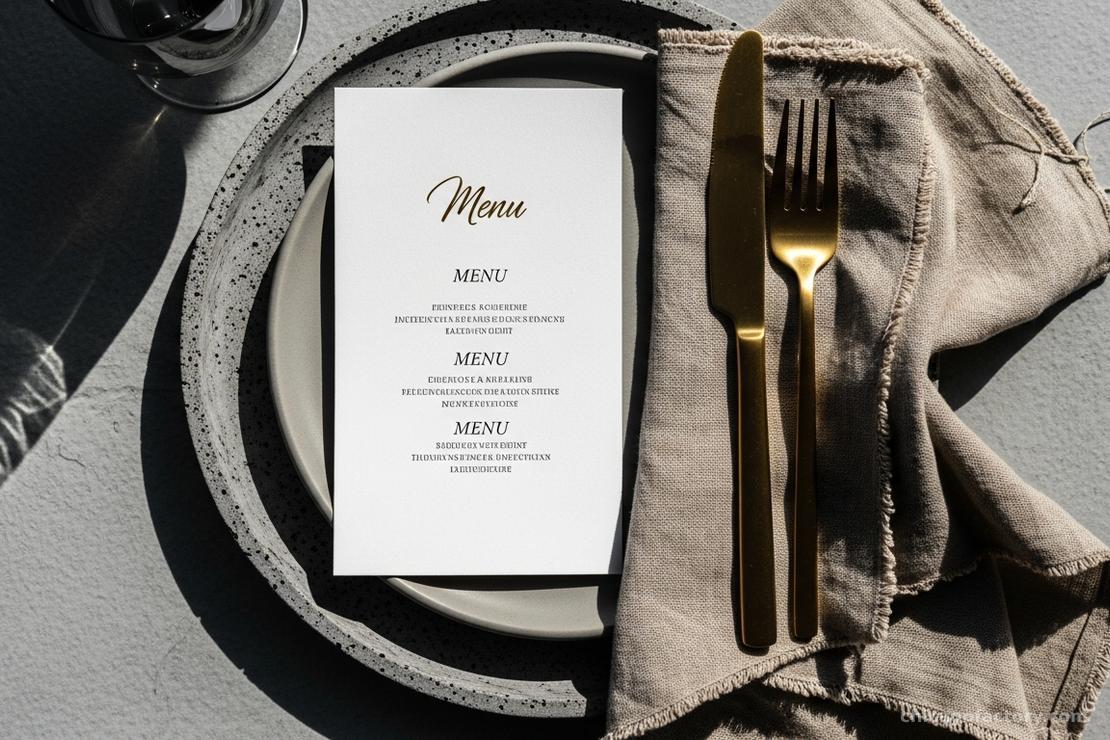
10% Accent Metal: Small details (e.g., copper foil on the menus or signage).
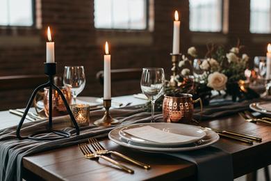
Copper: The Industrial Darling
Copper is synonymous with industrial design because of its use in plumbing and piping. It brings a fiery, orange warmth that looks incredible against cool grey concrete.
How to use it: Copper is bold. Use it for statement pieces like pipe arch backdrops or signage stands. Because it is a softer metal visually, it pairs beautifully with greenery.
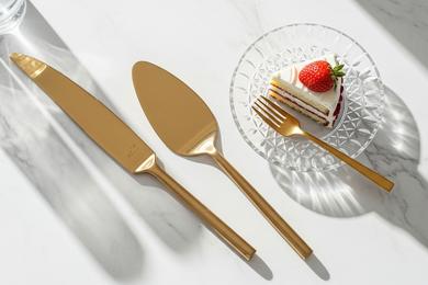
Gold: The Luxury Contrast
Gold is the ultimate signifier of elegance. When you place a brushed gold fork on a raw wood table, you create instant tension between "rough" and "refined."
The Finish Matters: Avoid high-polish, yellow gold, which can look cheap under warehouse lighting. Opt for Brushed or Champagne Gold. This subtle finish absorbs light rather than reflecting it harshly. We often use this for Table Settings to elevate a minimalist look.
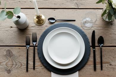
Steel & Iron: The Structural Anchor
Black iron and stainless steel provide the grounding weight in an industrial palette. They echo the factory windows and trusses found in loft venues.
How to use it: Use black metal for the "frames" of your design—lanterns, easel stands, and chair legs. It acts like eyeliner for the room, sharpening the edges of your softer decor elements. Even your Cake Cutting Set can be matte black for a sleek, modern photo op.
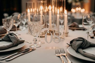
3 Winning Palettes
If you are stuck on where to start, these combinations are technically sound and aesthetically pleasing:
- The Modernist: Matte Black (Steel) + Brushed Gold + White Marble.
- The Warehouse: Raw Copper + Emerald Green + Grey Concrete.
- The Soft Industrial: Rose Gold + Slate Grey + Blush.
Frequently Asked Questions
Rose gold had a massive peak in 2016, but in 2025, we use it more sparingly. Instead of "pink" gold, look for "copper" tones. The difference is subtle, but copper feels more architectural and timeless, whereas bright pink rose gold can feel trendy.
Absolutely. The trick is to bridge them with a third element, like a two-tone charger plate or a linen that contains cool and warm threads.
Chairs are a huge surface area of metal. If your venue has silver Tolix chairs, don't fight it. Use silver in your centerpiece vessels to tie it together, then use gold for the place settings to add that pop of luxury.
About the Author